I’ve been playing NLP statistics games for a long time now, and got to thinking that I had no clue as to the statistical distribution of some of the things I work with. So below follow some graphs.

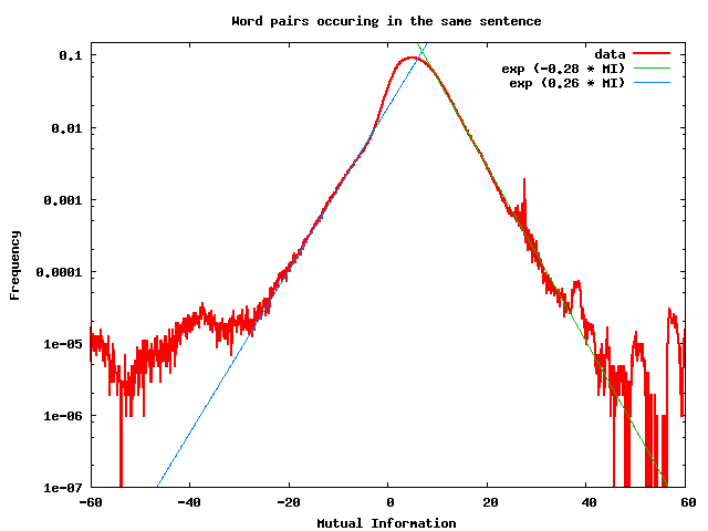
Above is a graph showing the distribution of the mutual information of word pairs that occur in the same sentence. A number of texts were analyzed, including a portion of Wikipedia, some books from project Gutenberg, etc. A collection of all possible pairs of words was created, where each word in the pair occurs in the same sentence (with the left word of the pair having occurred in the sentence to the left of the right word in the pair). These were counted — about 10 million word pairs were observed — and their mutual information was calculated.
Mutual information is a measure of the likelihood of seeing two words occur together: thus, for example “Northern Ireland” will have a high mutual information, since the words “Northern” and “Ireland” are used together frequently. By contrast, “Ireland is” will have negative mutual information, mostly because the word “is” is used with many, many other words besides “Ireland”; there is no special relationship between these words. High-mutual-information word pairs are typically noun phrases, often idioms and “collocations”, and almost always embody some concept (so, for example, “Northern Ireland” is the name of a place — the name of the conception of a particular country).
In mathematical terms, the mutual information of a word pair (x,y) is defined as:
M(x,y) = log_2 P(x,y) / P(x,*) P(*,y)
where P(x,y) is the probability of seeing the word pair (x,y), P(x,*) is the probability of seeing a word pair where the left word is x, and P(*,y) is the probability of seing a word pair where the right word is y.
The graph shows M(x,y) on the horizontal axis, and the probability of seeing such a value of M on the vertical axis. This is a bin-count of the distribution of possible values of mutual information, over all word pairs. This is *NOT* a scatterplot of M(x,y) vs. P(x,y).
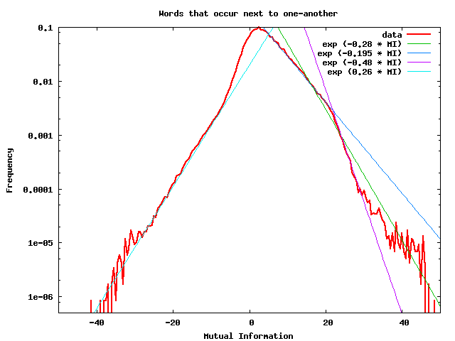
Here’s another graph: same as above, except that this time, only pairs of words that occur immediately next to one-another are considered. The sample size is much smaller: only about 2.4M word-pairs were collected.

The blue and green exponential lines are located in exactly the same place as in the previous graph. It’s humped in a different way than the previous graph. What is the shape of this hump? Are the slopes characteristic, or do they vary from one corpus sample to another? If anyone knows the answers to these questions, please let me know!
Notice the peaks off to the right, at high MI values, in the first graph. I think these are word pairs which are heavily used (topics/terms that are discussed) in one single contributing text, but in none of the others. That’s the hypothesis, I don’t know.
Here is a more detailed discussion, with many other additional figures.
These graphs were discussed on the corpora mailing list in March 2009. See http://mailman.uib.no/public/corpora/2009-March/008193.html and followups in that thread.
It was concluded that the gross features of the graph (i.e. the exponential fall-off) can be explained by drawing random pairs of words from a Zipfian distribution for single words (which seemed plausible to me, although I did not do the math to double-check/verify this).